Creating Action Scenes
Concept Art Tutorial 
After wrapping up my first fanart series on NieR:Automata (catch it right here), I would like to start a new walk-through series right here, on how I create action scenes for entertainment art. So, let's jump into it!
Step 1: Reference and Thumbnails
To start building a reference board, I use a free app called PureRef; it allows you to take any reference images that you like, and lay them out in an organized collage.
One thing to keep in mind when creating thumbnails, is it’s best to get as many ideas as you can down on paper. Don't be intimidated by that! There are no wrong ideas and it doesn't matter if it looks rudimentary at this stage.
One thing to keep in mind when creating thumbnails, is it’s best to get as many ideas as you can down on paper. Don't be intimidated by that! There are no wrong ideas and it doesn't matter if it looks rudimentary at this stage.
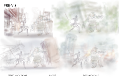
 When creating thumbnail sketches, think of what you want to see as
the main focus of the scene; so, in this case, I want to have the main character 2B
slashing a large machine – something inspired by an in-game screenshot. Now, with a rough sketch of both characters in that specific action pose, I
tried out a bunch of backgrounds for the scene, using some basic colors, to get a feel for the
world they'll be fighting in.
When creating thumbnail sketches, think of what you want to see as
the main focus of the scene; so, in this case, I want to have the main character 2B
slashing a large machine – something inspired by an in-game screenshot. Now, with a rough sketch of both characters in that specific action pose, I
tried out a bunch of backgrounds for the scene, using some basic colors, to get a feel for the
world they'll be fighting in.Step 2: Revised Thumbnails
Once you’ve got something you’re happy with, go ahead an sketch it
out more. You’re in the idea stage, so you’ve still got plenty of room to
explore. Try new combinations and placements within the scene.
With the pose of the characters selected, I built the scene composition around that. Depending on your preference, this could be in greyscale or colour. I chose to work in colour – using warm tones for the main character, that would contrast nicely with the blue and green hues of the enemy. With that all in mind, I went with thumbnail #3, primarily for the colour palette and composition – which looked like a high-risk, high-tension fight between the two characters, up on a high platform.
With the pose of the characters selected, I built the scene composition around that. Depending on your preference, this could be in greyscale or colour. I chose to work in colour – using warm tones for the main character, that would contrast nicely with the blue and green hues of the enemy. With that all in mind, I went with thumbnail #3, primarily for the colour palette and composition – which looked like a high-risk, high-tension fight between the two characters, up on a high platform.
Step 3: Sketch
Now that you’ve have your composition down, we can get into some
detail work. This is where you take a hard look at your composition and if it
flows nicely and in the way you would like, you start to breathe more life into it. Here, I worked
on defining the anatomy of the characters and the transmission towers in the
background – putting focus on the perspective of the towers and platform the
characters are fighting on. What’s also helpful here, is to lower the opacity of the
revised sketch and draw clean lines overtop of that layer. Another good
tip is to flip the canvas, from time to time, to check the anatomy and
perspective of the scene.
Step 4: Base paint
Just like a colouring page, all you do here is stay within the lines.
Don’t worry about detail, definition, shadows or highlights, this early in the game; you’re laying down the base colours and seeing how they work together.
Since I want the complimentary red and green to be the two main colours in the scene, I start painting the characters and work within those hues; reds and
yellows for 2B and greens and blues for the Machine. To give me spatial awareness, I also added a touch of
colour to the platform and transmission towers.
Step 5: Lighting
Now you can bring in the definition, using shadows and highlights.
Just like flipping the canvas helps to check anatomy and perspective, when
working with defining colours it helps to actually get rid of them. Which means working in
greyscale! A quick way to do this is to create a new layer in your painting
program of choice, fill it with black and use the Saturation blending mode. You
can name this layer 'Value'. That way you can turn it on and off to check if some
of the colours you're using are too saturated or not nearly enough.
Step 6: Render
Now that the values read correctly, this is the stage where you
blend the colours more and put subtle lighting from the main light source into the scene. Here, I have a soft light coming from right, where the sun is obfuscated behind clouds.
When considering where the light falls in the image, the next step is to add shadows cast by that light source. I begin to define the shadows on the characters and platform in the foreground, as well as the primary transmission tower in the mid-ground.
Then I start to build up the atmosphere; the thick smog in the background coming from the pipes below the platform, the layer of smoke in the midground and thinner fog closer to the foreground. I use a red-brown to build up the smog in the distance, then add a smokier grey that's visible in the midground, along with a paler shade used for the fog up close.
This is where more of the colour details are added. I darken the towers, platform and control building in the background. I also continue to define the characters and add in 2B's combat pod – for firing at the machine and bombarding it with missile strikes.
I add more shading to the platform, with the use of red, brown and grey colors for shading. I try to keep away from absolute black, instead using more of a dark red to contrast the dark green-blue used for shading on the machine.

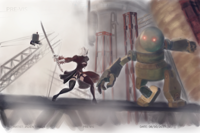
Finally I put in some additional fog and atmospheric effects. I complete the painting by adding motion blur to 2B and her pod, and to the lumbering machine.
There we have it! A walkthough of the concept design process for pre-vis – from thumbnails sketches, to linework, to final render!
This project was a massive learning experience for me; I hope this gives you a few tips and tricks to add to your concept art process! See you in the next tutorial.
Then I start to build up the atmosphere; the thick smog in the background coming from the pipes below the platform, the layer of smoke in the midground and thinner fog closer to the foreground. I use a red-brown to build up the smog in the distance, then add a smokier grey that's visible in the midground, along with a paler shade used for the fog up close.
Step 7: Polish
This is where more of the colour details are added. I darken the towers, platform and control building in the background. I also continue to define the characters and add in 2B's combat pod – for firing at the machine and bombarding it with missile strikes.
I add more shading to the platform, with the use of red, brown and grey colors for shading. I try to keep away from absolute black, instead using more of a dark red to contrast the dark green-blue used for shading on the machine.

Finally I put in some additional fog and atmospheric effects. I complete the painting by adding motion blur to 2B and her pod, and to the lumbering machine.
There we have it! A walkthough of the concept design process for pre-vis – from thumbnails sketches, to linework, to final render!
This project was a massive learning experience for me; I hope this gives you a few tips and tricks to add to your concept art process! See you in the next tutorial.


Comments
Post a Comment